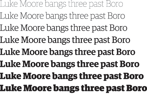
Guardian egyptian headline
designed with Christian Schwartz
1994-
Like all experiments; its often the unexpected that is the most interesting. We all concluded that the Egyptian offered more than the sans; it could become a vital part of the Guardian brand. It offered the same range of weights that a sans could, but could also offer some of the qualities of a serif.
